
GRAPHICS IDENTITY STANDARDS GUIDELINE
This is a guide to design identity guidelines for all visual communication media of e.p.t.q.
This is a control guideline that is thoroughly reviewed and worked to establish, improve and efficiently manage the image of e.p.t.q.,
so make sure of accurate understanding and usage.
Mark / Color system
Word mark (color system) is a representative design element that symbolizes e.p.t.q. and plays the most important role in establishing the identity of e.p.t.q. and overall image.
Therefore, make sure to use it correctly according to the regulations for each item exemplified in the manual so that the image of e.p.t.q. can be delivered correctly.
Color

EPITIQUE BLACK_PANTONE Black C
K100
R35 + G31 + B32

EPITIQUE _PANTONE 2728 C
C96 + M69 + Y0 + K0
R0 + G92 + B171

EPITIQUE _COOL GRAY 7
K37
R88 + G89 + B91


Main Color
EPITIQUE _PANTONE BLACK
K 100
R 35 + G 31 + B 32
EPITIQUE _PANTONE 2728 C
C96 + M69 + Y0 + K0
R0 + G92 + B171
C. 96%
M. 69%
Y. 0%
K. 0%
R. 0%
G. 33%
B. 67%
Sub Color
EPITIQUE _PANTONE COOL GRAY 7
M0 + Y0 + K37
R173 + G175 + B178
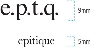
Minimum size
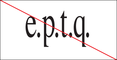
Changing the proportion of wordmark
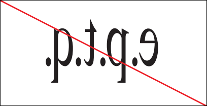
Using a ninverted wordmark
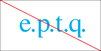
Using a color other than designated color of wordmark
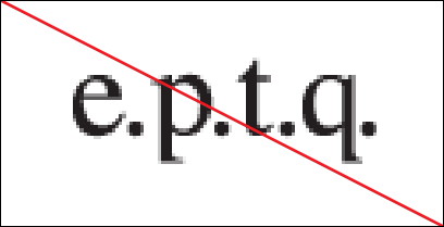
Using a wordmark in bad condition
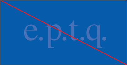
Using a wordmark on the background color of a similar color and the sharpness is lowered


